Baby Room - Part 2: Paint & A Little Glamour
The Paint Color
One of the first big decisions was paint colors. In order to make the room feel as spacious and airy as possible it was immediately clear that we would use a light grey color. After narrowing down the countless grey paint colors to those within a few hues, we still needed to make sure it was tinted enough that it would provide enough contrast with the white. We selected a few different grey options, and the clients took them for a test drive for a few days.
Which will it be?

It's always best to “live with” colors for a little bit, and have the opportunity to see it under different light situations. After a couple days we had a winner!
Here we are all primed and ready for paint:

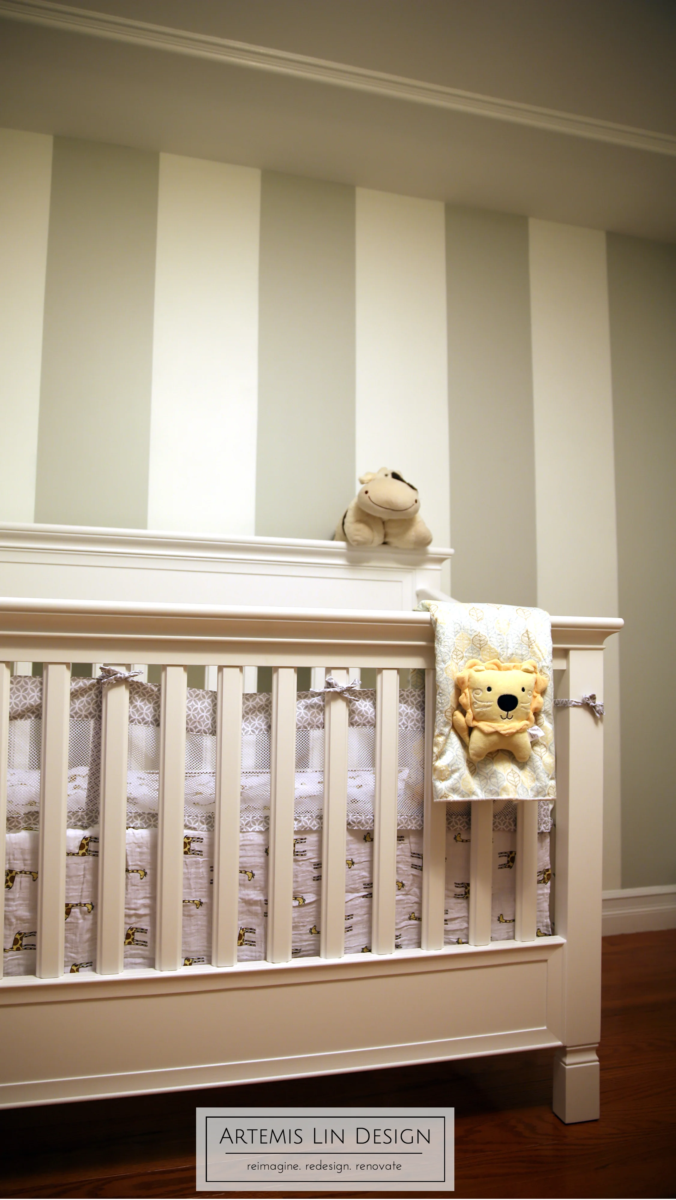
For the accent wall we opted for a vertical stripe pattern to make the room feel taller. Also, the crib will be going in front of this wall so we didn't want to block half of them. The first step was deciding on the width of each stripe. We took into account the total width of the wall, the electrical outlet on the wall (we wanted to do our best to center the outlet within a stripe and it worked out to be dead center), and of course the overall "look" the clients wanted. We didn't want too many stripes and have it look like pinstripes, and decided on approximately 1 foot wide stripes which we thought would give the room a classic look that they wouldn't get tired of looking at. After some careful measuring, taping, and a few coats of paint... we have perfect, crisp stripes!
Check out the nice crisp edges!

The Ceiling
The clients have crown moulding throughout their home and we loved the idea of bringing a touch of that into the nursery as well. However we felt it would be too awkward given the unusual soffit and wall bump out in the corner to do traditional crown moulding. You’ll remember that one of the design goals is to minimize the oddities - not emphasize them further.
The solution? We skipped the crown moulding and used just a simple and elegant picture frame moulding. This little detail will really dress up the room and give the eye a focal point to distract from the unusual bump out. It doesn't hurt that it will also help the room appear taller and thereby bigger.
We were originally inspired by this image but opted for something less ornate.

We tested the positioning with some tape, making sure to maintain balance between the distance to the wall and keeping the light fixture centered. Once we were happy with the placement, it was on to cutting and painting the moulding and then fastening it to the ceiling.
Of course, it never is as simple as it seems. The clients knew that there were ducts and pipes running in their ceiling but they didn't know exactly where. So instead of using nails, we decided to use glue adhesive with a nice strong hold. The other issue we came across is true for 99.9% of rooms: the ceilings were not level throughout the room. On one side of the room the floor to ceiling measurement was nearly 2 inches taller than the opposite side and the ceiling had a visibly convex curvature. To compensate, we used some shims to make up the difference, followed by some caulking to make it all nice and seamless. Took a little time, but we think the finished product was well worth the effort.
Ooh la la!

Next Time
The design concept gets revised, and furniture decisions get made!
What do you think of the progress? Can you guess which grey won? Let me know in the comments below!