Baby Room - Part 5: The Reveal
It's finally time to reveal the room! But first, a reminder of where we started.
You may remember that our goals included making the space feel as big as possible (room measures a modest 9'x12'), add plenty of storage (room has no closet), and minimize some of the structural irregularities (notice the bump out to the right of the door). And let's not forget making it gender neutral, budget friendly, and a beautiful space!
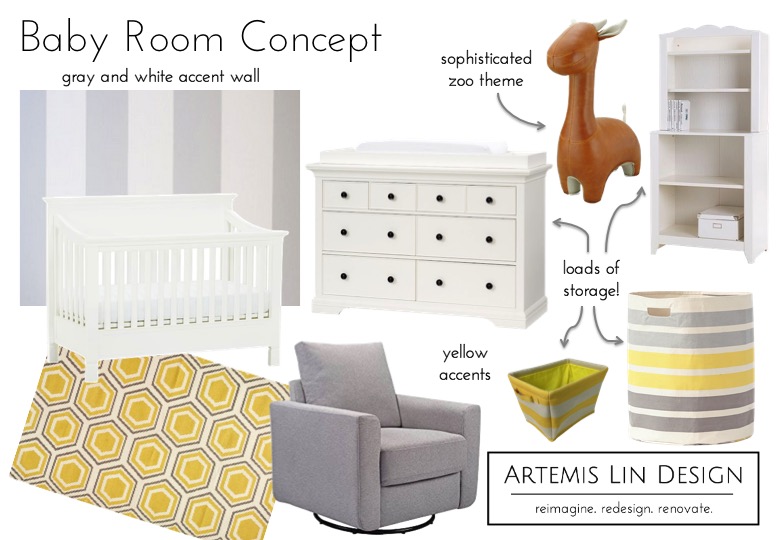
It all started with a design concept that centered around the colors white and grey, with a striped accent wall and a fun zoo theme.
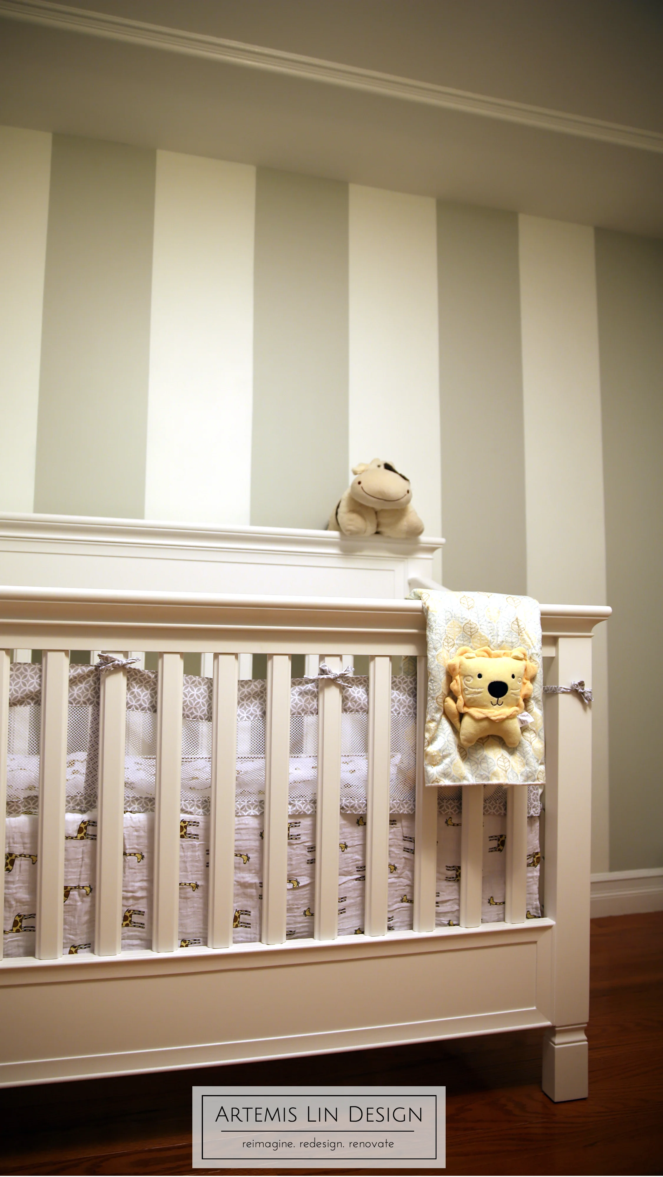
Paint color selections were made, and all 4 walls were primed and painted grey. Then we moved on to the accent wall by carefully measuring and taping, and applying a few coats of the white paint. After allowing time for the paint to dry, the tape was carefully peeled off and we had beautiful crisp stripes.
Next a little trim was added to the ceiling to draw the eye away from the irregular ceiling shape.
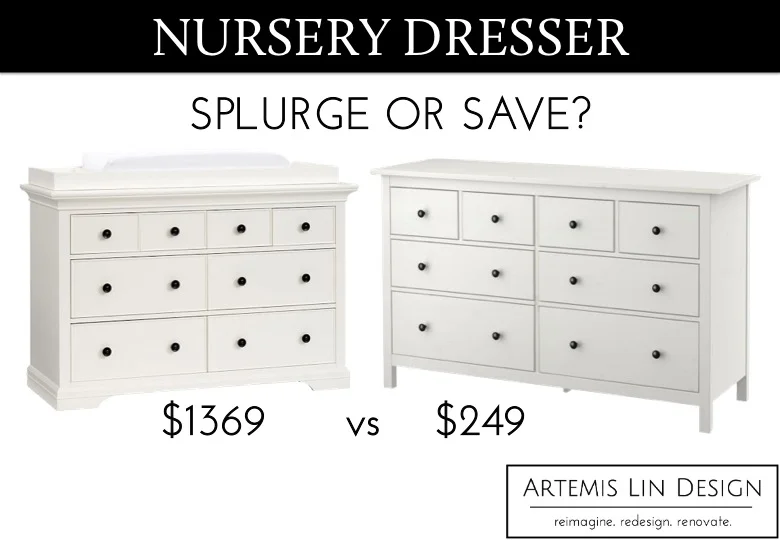
Then we moved on to furniture. The parents-to-be splurged on the crib selection, so a more economical dresser was selected.
Artemis Lin Design - White nursery dresser and changing table options; high vs low aka splurge or save options from Pottery Barn vs Ikea
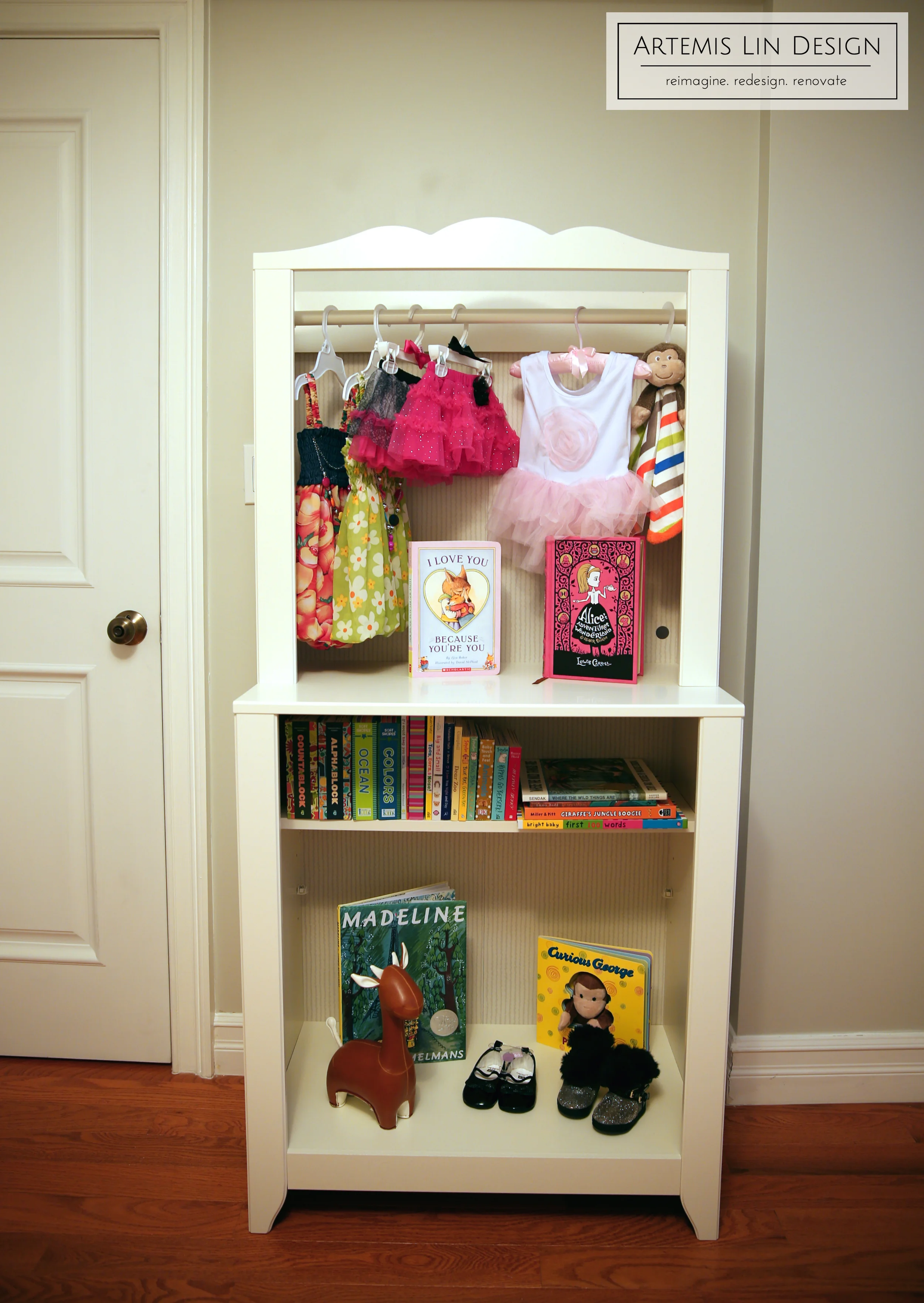
The dresser would be a storage work horse, but why stop there? Open storage was brought in with a shelf unit, and included a little hack to add the hanging rod and bring in a little decorative element as well.
And here it is all together!
And that's how we transformed a spare room into a sweet little nursery!
What do you think?


