Baby Room - Part 3: Change in Plans
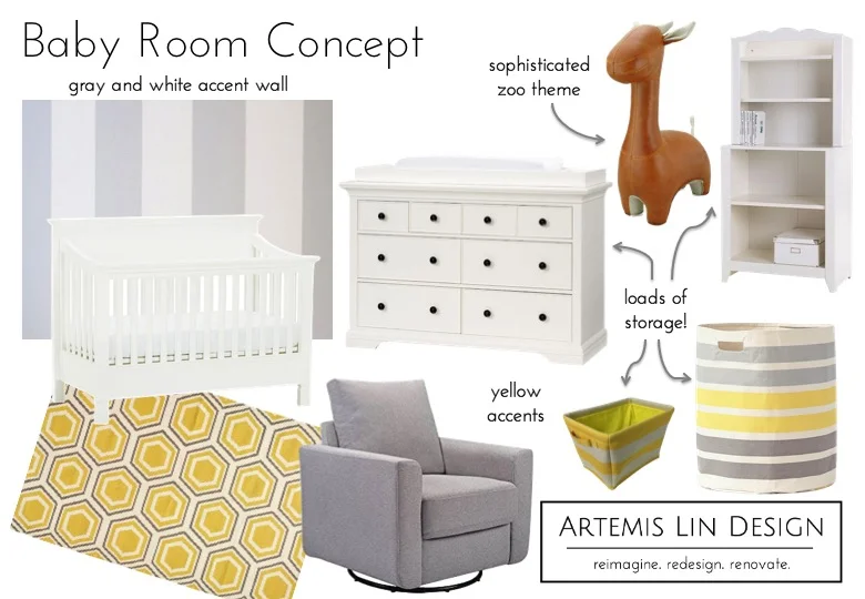
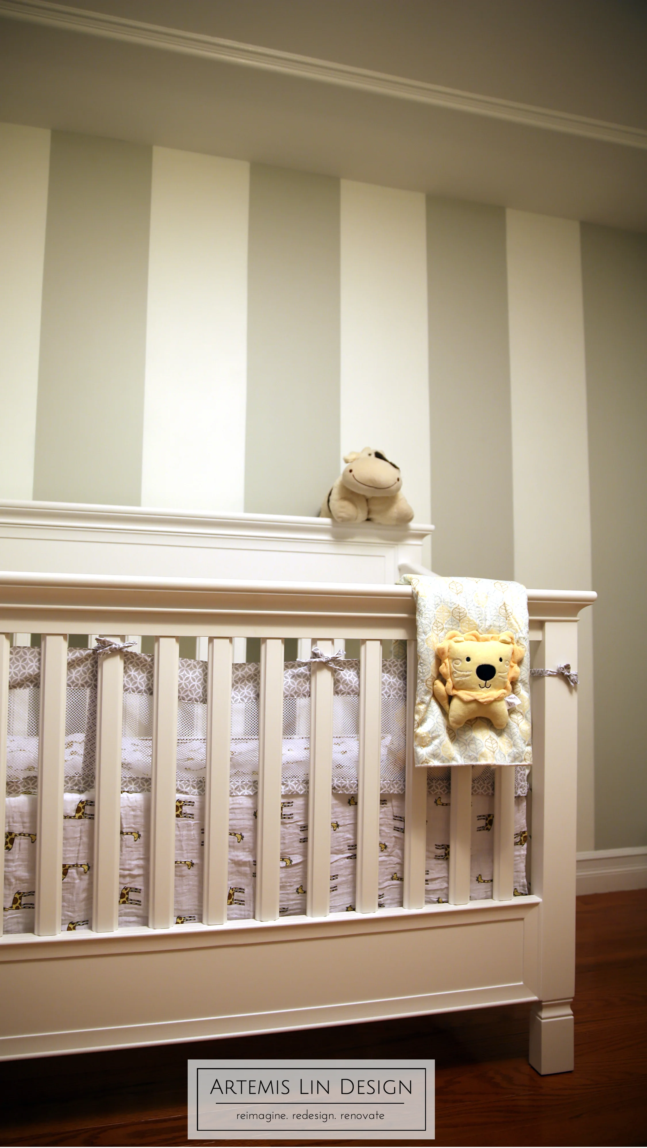
Clients Mom & Dad sense of style leans towards the traditional and after the decision to add the ceiling moulding, we modified the design to make things more transitional. The dresser and bookcase share the crib's more classic silhouette, while the color scheme and accessories still give it a modern touch.
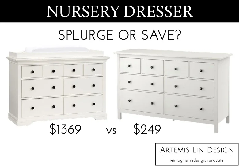
You may have noticed back here that the room doesn't have any closets, so storage was an important design consideration. Our first step in tackling this was to find a hard-working dresser. Two options were proposed, a "high" and a "low" -- aka, spend or save?
"Spend" dresser // "Save" dresser
Both options were pretty close in width and height, and both came with black metal knobs. Stylistically, the main difference was the Splurge version came with a changing attachment and had a more elaborate base trim. Between the substantial price difference and the fact that Mom-to-be wasn't interested in a changing attachment as she has her eye on a particular changer, it made the decision pretty easy!
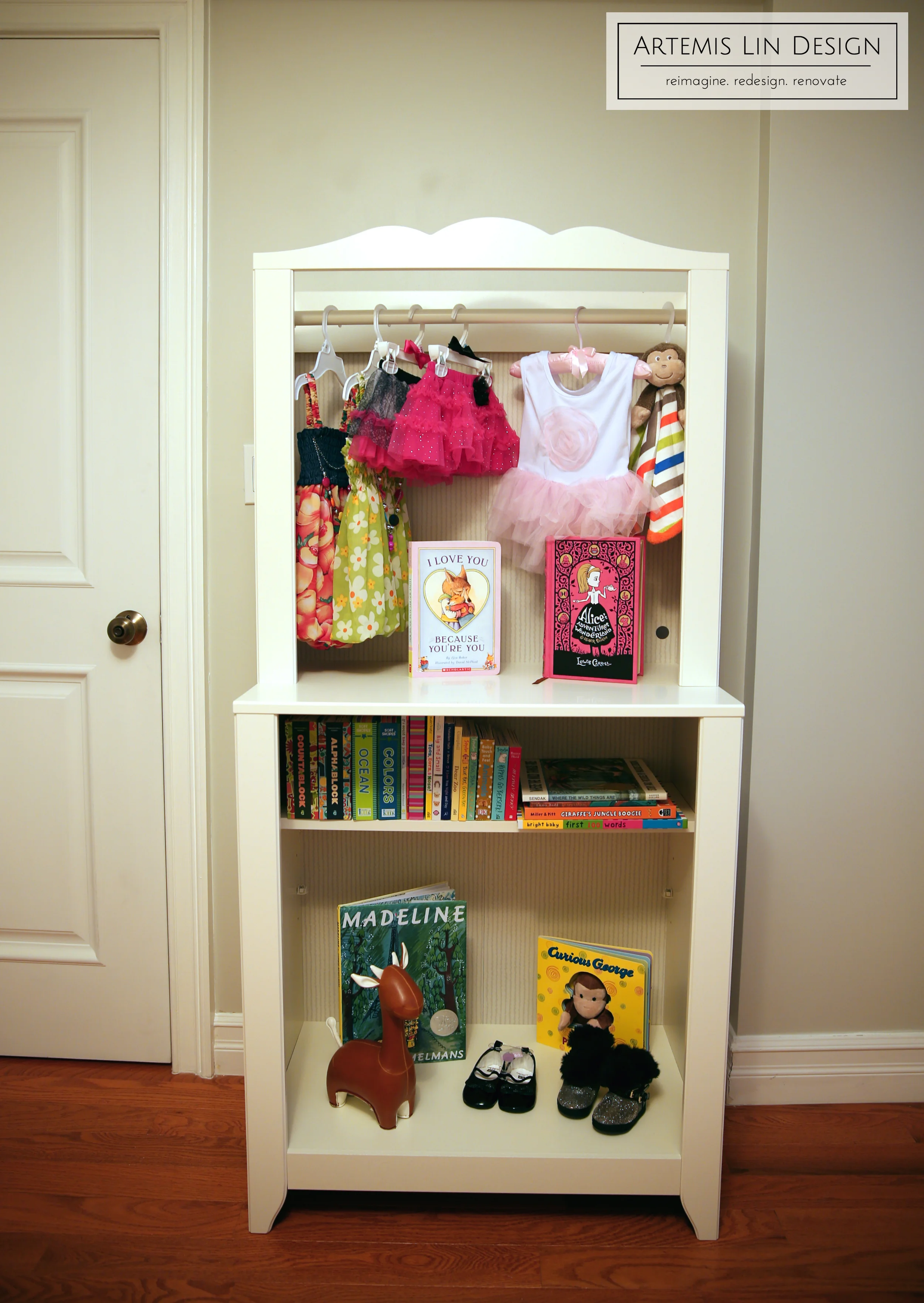
Even with the tons of storage that 8 drawers will provide, we still wanted to add a little more storage. Do you remember that little bump out in one corner? We also wanted to minimize the general awkwardness of that by placing something between it and the light switch so it wouldn't be as noticeable. This little shelf unit fit the bill... almost, but not quite. Stay tuned for a little hack we have planned!


