Project Reveal: Gramercy II
Please note: This post contains affiliate links. Click here for more info.
Welcome to Gramercy II! Too? Two? Anyhoo! (I may have read a Dr. Seuss or two...)
This project was in the Gramercy neighborhood of Manhattan, an area very familiar to me. But the nature of this project was a little bit different in that it was to renovate an investment property for purposes of rent. With that in mind, the design priority was to not only give the whole space an overhaul (just wait until you see the before) that would include features to make it highly marketable and that would help garner higher rates, but to do so on a tight budget.
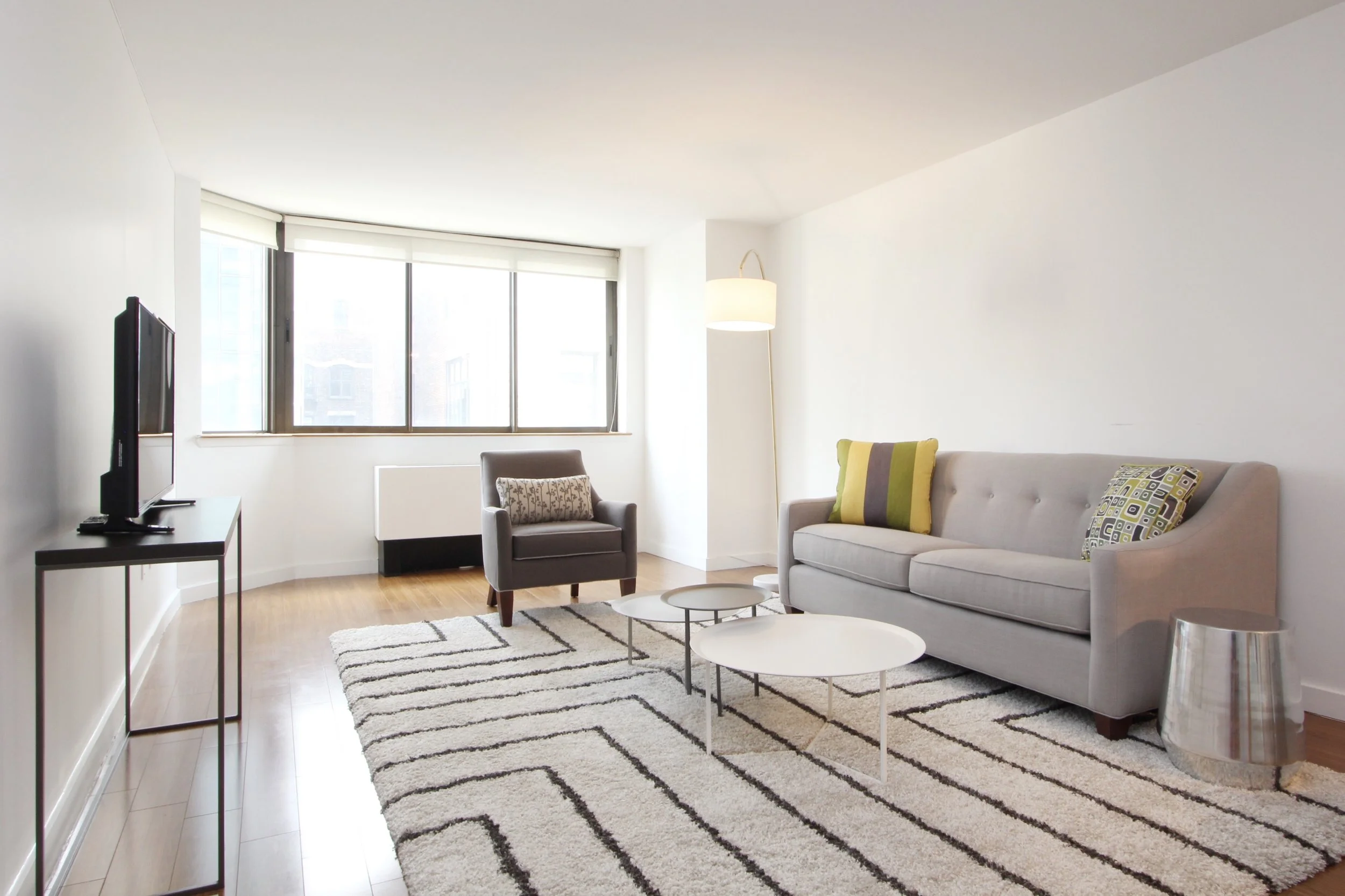
The 1 bedroom apartment was targeted for young urbanites, so a clean and contemporary aesthetic was developed. A palette of various soft whites and grays was selected to give the place much brightness and an unmistakably contemporary feeling. The mid-toned floors provide an organic warmth.
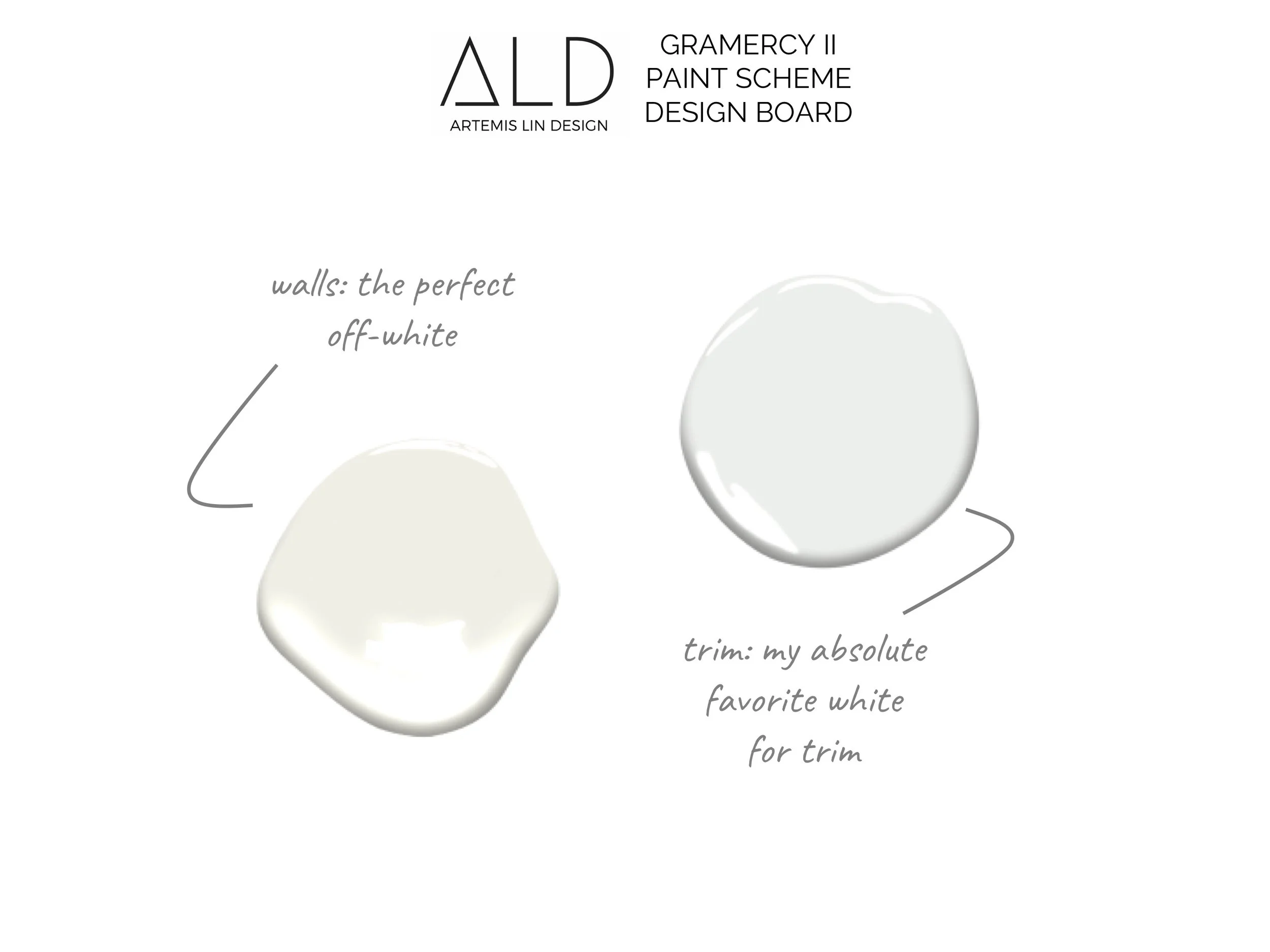
I wanted the place to be bright, but not hospital-white. Warm, but not beige. Walls were painted in the perfect color of white-but-not-white-and-not-cream (one of my favorites from Benjamin Moore). And baseboards were painted in a crisp-white for a subtle but unmistakable contrast.
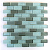
Like most city apartment kitchens, this one's is pretty petite in size to begin with, but to make matters worse the old galley-style kitchen was also closed off from the rest of the living space. The finishes were all pretty tired and drab, so there was no love lost to demolish the whole thing. In it's place, an open concept kitchen with a super durable quartz countertop and an island area that could easily serve multiple purposes. To keep things as open-feeling as possible, cabinets and a simple subway mosaic backsplash were both kept in a clean white palette.
Brace yourself, here's the before, complete with the awkward "pass-thru" cutout.
In the bathroom, all the major items were in good condition. Things were a little dull in all white, but thankfully there wasn't anything terribly self-dating like black marble or pink pinwheel tiles - a girl can always work with white! The space was given a facelift with a new sink, fixtures, and the addition of a colorful accent wall to punch things up a bit.
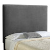
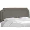
The white and grey color theme was continued in the bedroom. An upholstered grey headboard brings a softened visual appeal. Crisp white hotel-style bedding complete the bed.
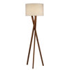
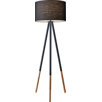
In addition to a tripod floor lamp, some recessed lighting was also added to help keep things bright and add layers of lighting.
With space always at a premium in Manhattan, the closet spaces also got some TLC. A walk-in closet in the hall was lined in cedar for a memorable touch. In the bedroom, a large wall-to-wall and floor-to-ceiling closet was created, with doors that opened the whole width and height of the closet. No way a prospective tenant could forget those features!
The windows were dressed in simple roller shades to maintain the clean-lines and contemporary aesthetic. In the bedroom, a black-out material was selected to allow for blissful shut-eye in the city that never sleeps.
Meanwhile, in the living area a light-filtering material was selected to provide a little privacy and cut glare while still allowing plenty of light - and this boy does this apartment have it! As a bonus, the synthetic material for both are also durable and easily cleaned.
So there you have it! A bright & contemporary space for the young urbanite.
Until next time!
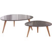
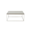
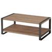
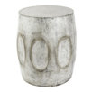
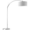
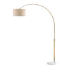
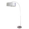
Feeling inspired? Here are some affordable picks to help you get the look:


