2018 Color Trends: Beyond The Chosen Ones
Hello again!
Last time I spotlighted the 2018 Color of the Year choices from Benjamin Moore and Sherwin Williams - Caliente AF-290 and Oceanside SW6496. We also looked at some inspirational ways to use these bold colors, including some ways to do so even if you're not "a color person." But if this is still too much for you, read on for some other trends that might be more your speed.


Beyond Just the Color of the Year
In addition to the top picks, each of the color houses also unveil carefully curated palettes of colors. These colors not only pair well with the Color of the Year but are also trend-right colors on their own.
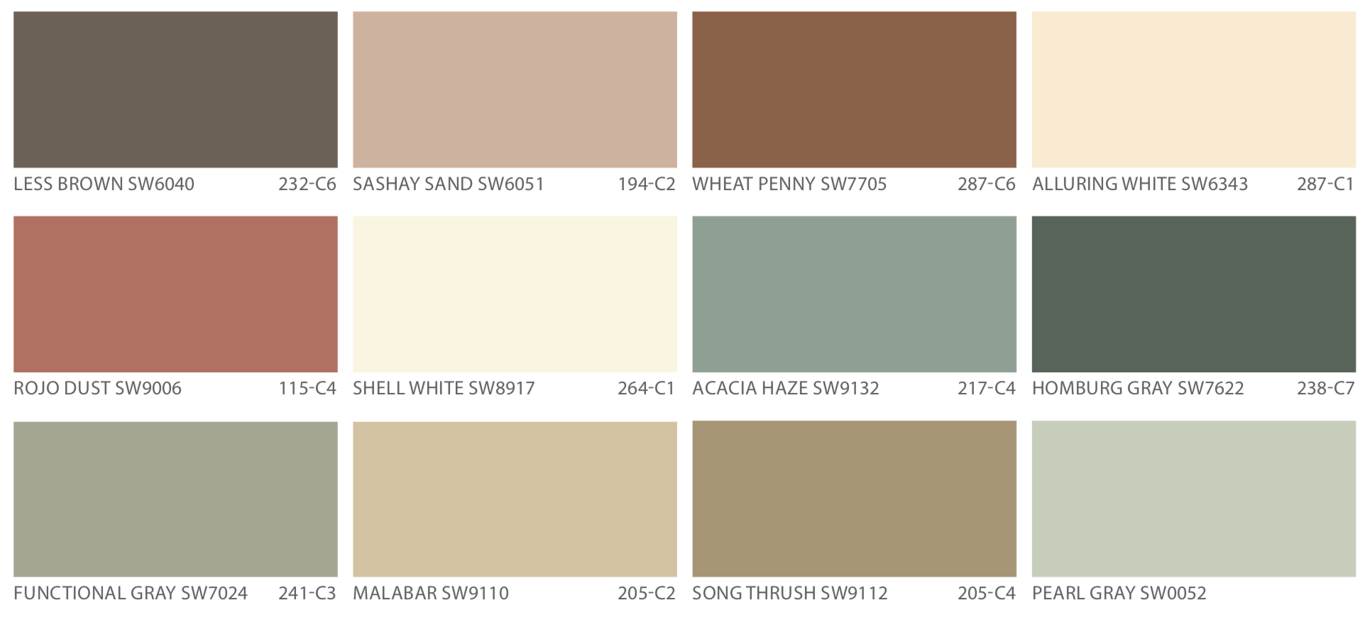
Benjamin Moore's palette is full of earthy tones across all hues, from pinks to grays and even greens and browns.
Benjamin Moore 2018 Color Palette

While out running errands and doing some fall shopping, I found this palette perfectly summed up in one gorgeous little rug! And let me also point out that I even have the gold trend represented on my feet - just translate that into a light fixture or some hardware!

Sherwin Williams takes a slightly different route and introduces three separate palettes which they've named Sincerity, Unity, and Connectivity.
Sherwin Williams 2018 Sincerity Palette
Sherwin Williams 2018 Unity Palette

Sherwin Williams 2018 Connectivity Palette

The one I'm digging the most is what they've dubbed "Sincerity." I find it interesting that there's definitely some distinct similarities between the Sincerity palette and the Benjamin Moore 2018 color palette. Great minds must think alike!
Using the Various 2018 Palettes
Despite color trends, the reality is that grey and neutral paints remain consistently popular. Case in point: 24 of the top 50 Sherwin Williams colors are classified as a shade of grey! Since there's a pretty good chance some of your walls are already a tone of grey, I think a very comfortable way to incorporate some of these latest color trends is to select trend colors that will play well with your existing neutrals and greys. That could mean repainting select walls or rooms, or simply re-accessorizing to breathe new life into your space.
One very natural progression is to incorporate some blush tones. And then of course to sprinkle in the ever-popular brass accents!
This little vignette captures it nicely - and shows you that it doesn't need to cost a lot to be part of this trend. Just a couple accent pieces can do the trick, paired with existing bigger-ticket items.

Photo: Target
To keep it from becoming overly feminine, I like the idea of grounding the design with some darker black or charcoal colors.

Photo: Jeff Lewis Design

Photo: Revamp Restyle Reveal
As you can see, this color palette can not only be utilized anywhere from a nursery to a living room, but it can also be interpreted in a variety of lifestyles, ranging from a youthful contemporary space to spaced that are a little more sophisticated and tailored.


Photo: Mead Quin

Photo: Walter E Smithe
I also like balancing the blush pink with hues of deep navy.

A Palette of Pinks and Greys
I hope this has given you the inspiration to refresh your space! And don't forget to check out my room refresh package if you would like any help!
I leave you with a little sneak peak.

Until next time!


