Baby Room - Part 1
I'm so excited to share a baby room I've been working on!
The Before
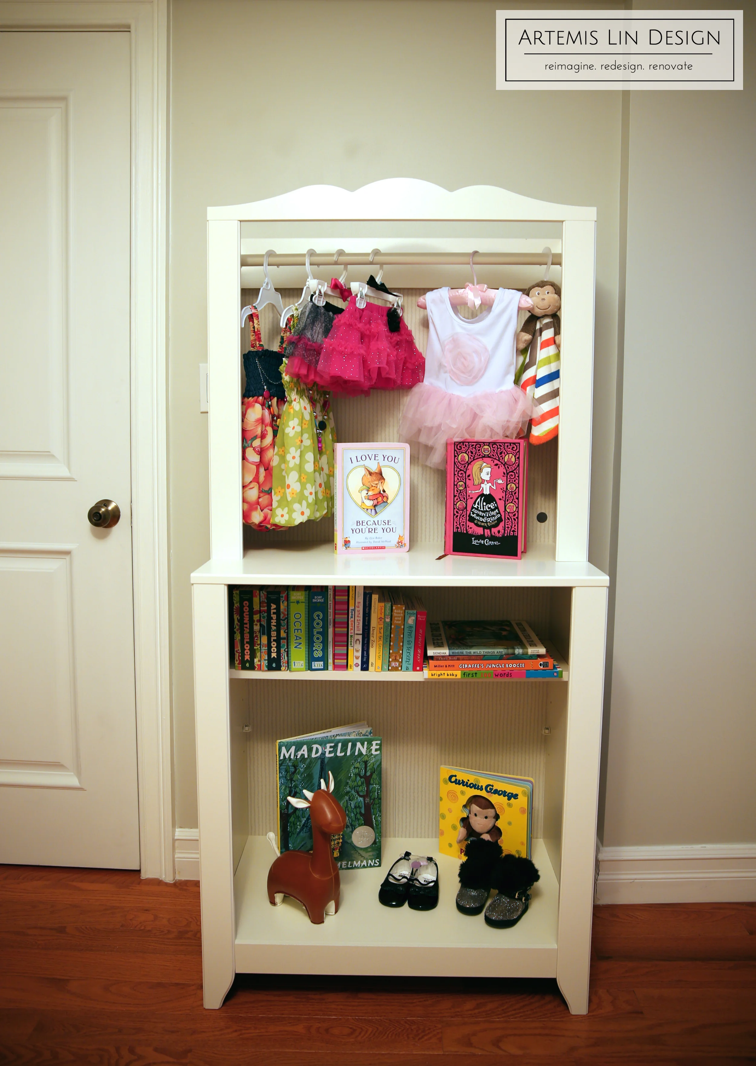
The room measures in at about 9x12, which isn't terribly large but certainly big enough for a nursery. In addition there are some soffits and bumpouts that make the walls not perfectly rectangular. On the plus side, the room gets tremendous light from 3 large windows. Our design goals: make the space feel as bright and airy as possible, work around and ideally minimize the structural irregularities, capitalize on all the natural light, and add lots of storage.
Notice the unusual soffit and wall bumpout:
Look at all the natural light!
The Color Scheme & Design Board
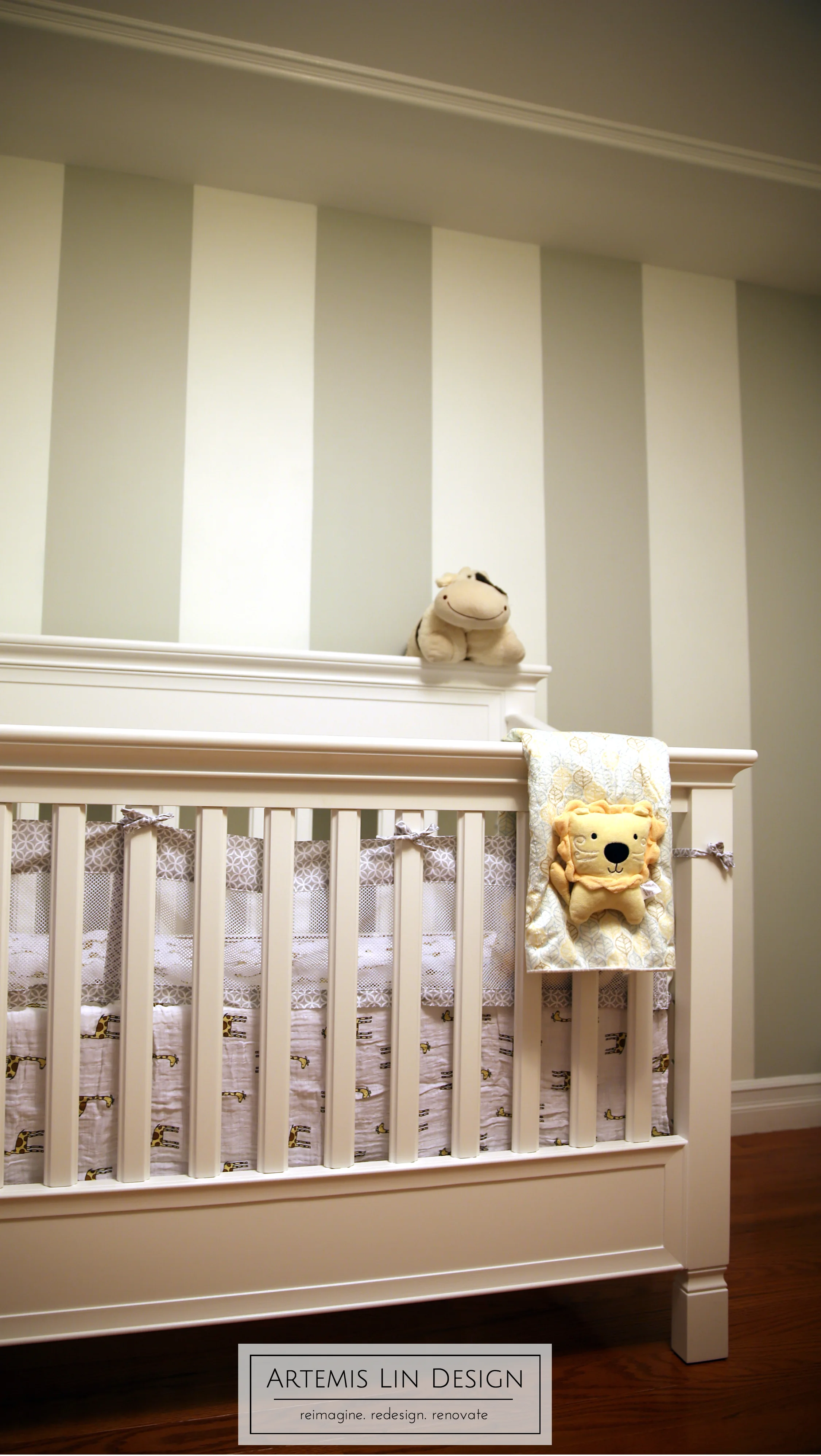
The room will be for client mom and dad's first kiddo, but with family plans for more down the road we needed to keep things gender neutral. We opted for a grey and white color theme, with cheerful bright yellow accents. And, a Zoo Theme!
Here's the first concept board we started with:
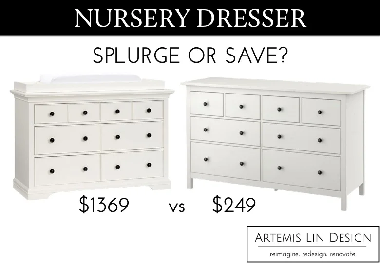
Since the furniture would be the largest investment, we opted for all white furniture. This would help keep things bright and airy, but also allow for flexibility in mixing and matching from different resources. And, white can easily be re-accessorized to make it a more masculine or feminine space down the road.
Next Time
Check back to see more room progress! Next up will be choosing paint colors and painting the accent wall. And also, some special plans to dress up the ceiling.


